2D Graph
The 2D Graph allows you to graphically view and analyze a position risk graph or sensitivity graph for a combination of simulated option spreads and current positions.
 To view a 2D graph of selected positions and simulations, select 2D from the drop-down menu
near the top of the Analysis tab.
To view a 2D graph of selected positions and simulations, select 2D from the drop-down menu
near the top of the Analysis tab.
Setting up the 2D Graph
Use the following controls to set up the graph:
 Graph Dimension – To view a spread profile in 2D, select 2D from the drop-down menu.
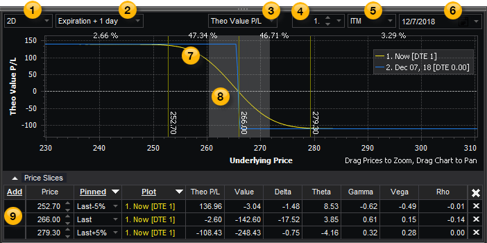
 Plots – Allows you to draw up to four plots representing four different dates between now and the date of expiration. Select Expiration + 1 day to display two plots (one plot will show today's risk curve and another the risk curve at expiration), Expiration + 2 days to display three plots, or Expiration + 3 days to display four plots. This gives you a graphical view of how time decay affects your position as each plot progresses. The number of plots you select will be reflected in Settings.
 Graph Type – Contains a drop-down list of different types of data that can be plotted in the Risk Graph. You can choose Theo Value P&L, Delta, Theta, Gamma, Vega, or Rho to be plotted in the Y axis (along the left side) of the graph. Profit or Loss in dollars is also shown along the Y Axis. The X axis displays the underlying asset price.
 Probability Standard Deviations – Allows you to adjust the number of standard deviations from the Nearest Expiration, from 0.5 to 3.0 (1 by default). This is useful when performing probability analysis and mathematical expectation analysis on options positions.
 Probability ITM/OTM – Adjusts the probability shade in the graph, which shows the odds of an underlying asset staying within a range of prices during a specified amount of time. Select ITM to highlight the area that is in-the-money, or OTM to highlight the area that is out-of-the-money.
 Probability Date – Select the date to graph based on the Nearest Expiration (by default), or a date you select. To change the date, you can either type in the dates (use MM/DD/YYYY), or use the calendar. Click the drop-down arrow to display the calendar, and select the dates.
 Risk Graph – Plots the graph type selected in above.
 Probability Shade – Plots the probability shade selected in above. For more information, see Probability Shade.
 Price Slices – Includes one or more asset price points that you can monitor during a trade, and use to determine what a profit or loss might be if the underlying asset price were to change 5% or 10% higher or lower. A line at the bottom shows the Theoretical Profit and Loss (P&L) and how the Greeks will behave with changes in the underlying asset, and a vertical line on the Risk Graph marks where the price point affects your position. For more information, see Price Slices.
Vertical Line Cursor (Mouse Tracking)
As you move your mouse cursor across the 2D graph, a dashed vertical line follows the cursor and displays the x-axis price (near the bottom of the vertical line) and displays the y-axis values (in the legend) representing where the dashed vertical line crosses each plot.
![]() To zoom in on a portion of the graph, click and drag the underlying prices to the right to zoom in and to the left to zoom out. To pan the graph, click and drag the graph background to the left or right.
To zoom in on a portion of the graph, click and drag the underlying prices to the right to zoom in and to the left to zoom out. To pan the graph, click and drag the graph background to the left or right.
Graph Features
To access a 2D Graph feature, right-click on the graph and select one of the following:
Reset - Re-sizes the 2D Graph to a central position in the pane.
Help (F1) - Allows you to access the help page for the current panel, the 2D graph in this case.
Formatting
The 2D Graph provides you with the ability to customize its appearance and functionality. For more information, see Settings.