 To view a 2D graph of selected theoretical and real positions, click the 2D Graph tab or click View and select 2D Graph.
OptionStation Pro
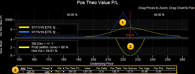
The 2D Graph allows you to graphically view and analyze a position risk graph or sensitivity graph for a combination of theoretical option spreads and real positions. The position profile in the upper portion of the graph can be compared with the Probability Cone of the price distribution for the underlying asset.
To view a 2D graph of selected theoretical and real positions, click the 2D Graph tab or click View and select 2D Graph.
The 2D Graph is divided into three sections:
 Risk Graph – Plots the selected Profit/Loss, Delta, Theta, Gamma, Vega, or Rho curves based on changes in the underlying asset price and days to expiration (DTE). The type and number of expiration curves displayed is selected from the 2D section of the Settings Panel.
 Probability Cone – Plots the probability of the underlying asset price movement based on the asset’s volatility and the time left to expiration. It helps show the odds of an underlying asset moving outside a range of prices within a specified amount of time. For more information, see Probability Cone.
 Price Points – Includes one or more asset Price Points that you can monitor during a trade, and use to determine what a profit or loss might be if the underlying asset price were to change 5% or 10% higher or lower. A line at the bottom shows the Position (Pos) Theoretical Profit and Loss (P&L) and how the Greeks will behave with changes in the underlying asset, and a vertical line on the Risk Graph marks where the price point affects your position. For more information, see Price Points.
The upper portion of the 2D Graph enables you to monitor the status of one or more theoretical or real positions at the same time. This can help you understand how the overall status of your combined position can change when other aspects of each spread change, such as time decay, implied volatility, or spread adjustments.
The types of graphs available are selected from the Graph section of the Settings Panel and include:
Each graph scales the underlying asset price on the X axis across the bottom. The Y axis (along the left side of the chart) can represent several different aspects of the spread – the most common being the Pos Theo P&L value. Using the X and Y axes, the chart plots a line showing the Pos Theo P&L based on Asset Price, time to expiration, and Implied Volatility.
The graph can draw up to four plots representing four different dates between now and the day of expiration. The number of plots and other graph parameters can be changed from the Settings Panel.
As you move your mouse cursor across the 2D graph, a dashed vertical line follows the cursor and displays the x-axis price (near the bottom of the vertical line) and displays the y-axis values (at the top of the graph) representing where the dashed vertical line crosses each plot.
![]() To zoom in on a portion of the graph, hover your cursor over the x-axis prices until the Zoom text appears, then left-click and drag the graph left to zoom out or right to zoom in. To pan the graph to the left or right, hover your cursor in the middle of the graph until the Pan text appears, then left-click and drag the graph left or right.
To zoom in on a portion of the graph, hover your cursor over the x-axis prices until the Zoom text appears, then left-click and drag the graph left to zoom out or right to zoom in. To pan the graph to the left or right, hover your cursor in the middle of the graph until the Pan text appears, then left-click and drag the graph left or right.
To access a 2D Graph feature, right-click on the graph and select one of the following:
Reset - Re-sizes the 2D Graph to a central position in the pane.
Help (F1) - Allows you to access the help page for the current panel, the 2D graph in this case.
The 2D Graph provides you with the ability to customize its appearance and functionality. For more information, see the Settings Panel.