OptionStation Pro
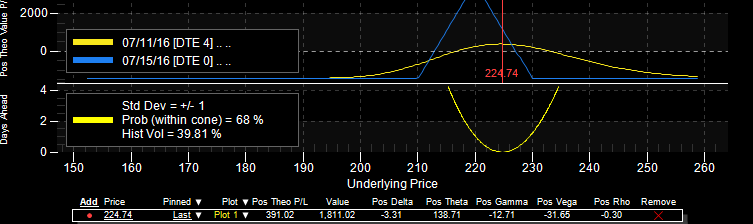
The Probability Curve can be displayed at the bottom of a 2D Graph to show the odds of an underlying asset moving outside a range of prices within a specified amount of time. The Probability Curve appears as a yellow bell curve just below the Risk Graph.
The probability curve is drawn based on the following parameters:
The Probability Cone shares the same X axis as the risk or sensitivity graph representing the underlying asset price. The Y axis along the left shows the number of days to expiration. Also, the top left corner of this chart shows the set number of standard deviations, the probability of the underlying staying within the cone, and the set Underlying Volatility Source and its current value.
This Probability Curve chart can be even more useful by checking the Show Cross Points check box in the Settings Panel. Doing this on a two plot graph will draw:
Two horizontal lines on the Probability Cone marking the expiration dates; and
Two vertical lines marking where each expiration line crosses the Probability Curve and the vertical lines intersect the Risk Graph.
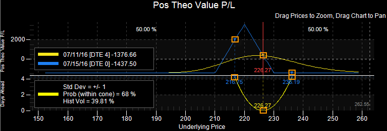
Probability Curve - Cross Points (2 plots). The squares  indicate cross points.
The dashed vertical lines show where the Probability Curve intersects with the plots on the Risk Graph (X-axis). As the number of days to expiration get less and less, the space between the vertical lines narrow.
A set of Cross Points and lines are drawn for each plot shown on the Risk Graph representing the dates defined in the Settings Panel.
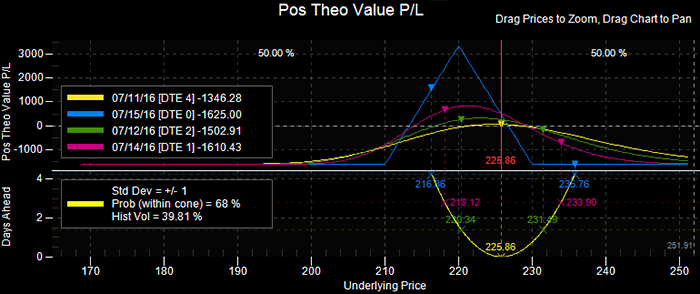
Probability Curve - Cross Points (4 plots)
The Cross Points and lines use the same color as the plots they are associated with. The graph can draw up to four plots representing four different dates between now and the day of expiration. The number of plots can be changed from the Settings Panel.