Linear vs Semi-Log Charts
Linear charts are commonly used to display recent price data (1 min, 30 min, daily) where the price movement is relatively small compared to the long term price of the symbol. When looking at prices over much longer time periods, however, it may be useful to look at data from a different perspective such a using a semi-log chart to try to give more weight to the percentage change in prices compared to just the absolute price.
![]() Access using the Data > Edit Symbol menu sequence and select the Scaling tab. Under Type, choose either Linear or Semi-Log.
Access using the Data > Edit Symbol menu sequence and select the Scaling tab. Under Type, choose either Linear or Semi-Log.
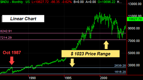
Linear Chart
When a chart is plotted using a linear price scale for the y-axis, each specific price range has the same vertical height as in the following Linear Chart example. If we compare the October 1987 price range to a similar period in 2002, it's hard to measure the significance of the October 1987 market move in terms of today's much higher market prices.
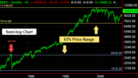
Semi-log Chart
If we look at the same chart plotted using a semi-log price scale for the y-axis on a Semi-log Chart, it's much easier to see how significant the October 1987 market adjustment was compared with recent market prices by showing similar percentage price changes as the same vertical height. For example, the October 1987 bar represents a price change of 63% from the lowest to highest price during that single month which compares to a similar 63% price change from 1996-2002.