TradeStation Help
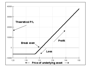
In the example below, the Position Chart displays long calls with the horizontal axis representing the underlying asset's price. Long calls are similar to a long position in a common stock where both benefit from an increase in the price of the stock. As the position plot line drops, the value of both the call option and the underlying asset price decrease. On the other hand, as the plot line rises, the call option and underlying asset increase in value. The price paid to purchase the option represents the break-even. Other positions will appear differently in a Position Chart, but the method of reading the chart is the same.
By using charts to plot positions, you can easily see the relationship between the position and either the price or volatility of the underlying asset or time. As search strategies are built using combinations of options and the underlying asset, charts are created in different shapes and configurations. These charts will also change to reflect different assumptions for volatility and date.
In the example below, the horizontal axis is based on changes in the underlying asset's price. Keep in mind you can also use the underlying asset's volatility or time to represent the horizontal axis.
For additional information on using Position Charts, see About Position Charts.
