Scaling in Price Charts
The y-axis displays values on the left or right side of the chart that are specific to the symbol or study when applied to the chart. By default the y-axis is located on the right side of the chart, however, you have the option to display it on the chart's left side or not have it appear on the chart at all. This is helpful when you want to display a study's scale on one side and the symbol's scale on the other, or when overlaying two symbols on the same sub-graph.
Displaying Dual Scaling in a Chart
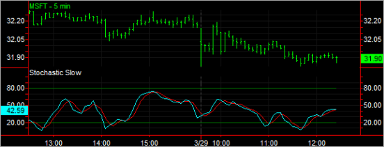
You can display two y-axis scales in a chart when overlaying a study on price data and uses a different scaling than the symbol applied to the chart. For example, if you overlay the Stochastic Slow indicator on a MSFT chart, for easier viewing you can display the left side y-axis to display the indicator's values and the right side y-axis to display Microsoft's price.
Displaying Dual Scaling with a Sub-graph in a Chart
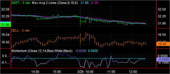
If you decide you want more than one symbol and studies appear in the same subgraph, you can choose which scale you want to appear in the left or right y-axis. This is helpful when you want to display a study's scale on one side and the symbol's scale on the other or when overlaying two symbols on the same sub-graph.
For example, if MSFT and DELL are applied to a chart each with a study plotted to each symbol, you can display the Microsoft price on the left side and have Dell's price appear on the right side of the y-axis.
Determining a Range Type in a Chart
To determine the price of a bar or study, you compare the height of the bar (or study) with the values shown on the y-axis. There are three types of ranges for scaling you can select from: Date Range on Screen, Entire Date Range, or Percent Below/Above Last.
- Date Range on Screen - The values on the y-axis range from the lowest to the highest values currently displayed without regard to the range of all data loaded in the chart. The y-axis only shows the range of values currently displayed in the chart. When you scroll left or right, the scale's high and low values change because they are based solely on what data is currently in the chart.
- Entire Date Range - The values on the y-axis range from the lowest to the highest values for all data loaded in the chart. In a chart using Entire Date Range scaling, the y-axis always shows the entire range of values and does not change no matter how far you scroll to the left or to the right of the current screen view.
- Percent Below/Above Last - You can customize the y-axis to your preference by including how the data is scaled and axis values are displayed. By default, the Below and Above values are determined automatically. Any charted values outside the custom range you specify are not shown unless you change the scaling.
![]() For
more information on customizing the scaling settings for a symbol, see Customize Symbol - Scaling. For more information on customizing the scaling settings for a study, see Edit Study- Scaling.
For
more information on customizing the scaling settings for a symbol, see Customize Symbol - Scaling. For more information on customizing the scaling settings for a study, see Edit Study- Scaling.
Related Topics
Applying Dual Scaling in a Chart