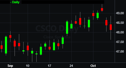
Candlestick Chart
Candlestick charting is an art form that has been passed down from the 1600s when it was used to trade Japanese rice futures. The name "candlestick" is used because the data in the charts are plotted to resemble what looks like a series of candles with wicks. Candlestick charting places a great deal of importance on the relationship between the open and closing prices for each bar.
The candlestick chart uses the same price data as a bar chart, with each candlestick representing the open, high, low and closing price. The "thick" part of the candlestick is known as the "real body" and represents the range between the open and closing prices. A hollow real body represents a bullish market - the close price was higher than the open price. A filled real body represents a bearish market - the close was lower than the opening price. The thin line above the body represents the high, and the thin line below the body represents the low.
A candlestick chart can be drawn with any data interval (except 1-tick bars). You are also able to apply any study to a candlestick chart that you can apply to a bar chart. When evaluating candlestick patterns, you can evaluate individual candlesticks or groups of candlesticks.
The following candlestick styles are available from the Customize Symbol window on the Style tab:
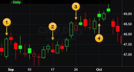
Candlestick - Displays candlestick bars as always filled where the bar color is used to show the hollow or filled bar state. By default, green indicates a hollow candle which represents an up bar (Close > Open), red indicates a filled body candle which represents a down bar (Close < Open), and gray indicates the wick above and/or below the body.
Candlestick with Trend - Displays
candlestick bars with hollow/filled bodies where the bar color is used
to indicate the trend direction. As is traditional, a hollow body  represents an up bar (Close > Open) and a filled body
  represents a down bar (Close < Open) regardless of the bar color. The color of a bar, therefore, shows the bar-to-bar trend, where green
  indicates an up trend (Close > previous Close) and red
  indicates a down trend (Close < previous Close), and grey
indicates no change in Close from the previous to current bar.
indicates a down trend (Close < previous Close), and grey
indicates no change in Close from the previous to current bar.
![]() For
a comprehensive list of commands line commands, see Command Line References (All Commands) or Command
Line Reference (Sorted by Application).
For
a comprehensive list of commands line commands, see Command Line References (All Commands) or Command
Line Reference (Sorted by Application).
Related Topics
Creating and Customizing a Candlestick Chart