Adding or Overlaying Symbols on a Chart
When a symbol is added to a chart, it can either be displayed in its own sub-graph or overlaid with one or more other symbols on the same sub-graph.
Add Symbol
- Activate a Chart Analysis window containing at least one symbol.
- From the menu, click Data > Add Symbol. The Add Symbol dialog is displayed.
- Type a symbol name in the Symbol box or select one from the drop-down list.
- Click Plot.
Overlay Symbols or Add with Customized Settings
Overlaying multiple symbols on a sub-graph allows you to see relative price movements of the symbols during the same time period.
- Activate a Chart Analysis window containing at least one symbol.
- From the menu, click Data > Add Symbol. The Add Symbol dialog is displayed.
- Type a symbol name in the Symbol box or select one from the drop-down list.
- Place a check mark in the Prompt for editing box to edit the customization settings for the symbol.
- Click Plot.
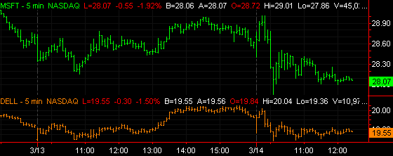
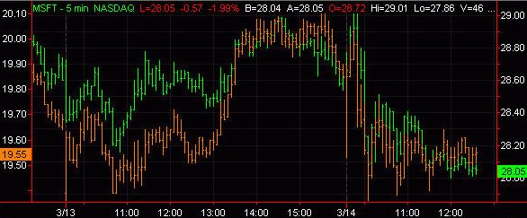
The Chart Analysis window will now display the symbols plotted in the chart:
- From the Customize Symbol [symbol] window, select the Scaling tab.
- Under Axis, from the Scale On drop-down list:
- Left Axis - To have the new symbol displayed based on its own scale range settings with the scale displayed to the left of the chart.
- No Axis - Display the symbol using its own scale range but not show the scale on the chart.
No Axis' values are not tied to the prices displayed on either axis. For more information about axis settings, see Changing the Vertical Axis Settings for a Chart.
- From the Sub-graph drop-down list, select 1 to have the symbol displayed in sub-graph #1. If you want to display multiple symbols in another sub-graph, use the appropriate number instead.
- Click OK to plot the new symbol on sub-graph #1.
The second symbol plots in a different color and automatically scales itself so that it overlays the first symbol even though the scales are not the same.
- To see underlying price details for each charted symbol, click near a bar (not on a bar) and move the cross hairs so that the vertical line aligns with a bar interval. The Data Tip window shows separate columns for each symbol including the date and time of the selected bar along with related data.